
Let’s face it. No matter what anyone says, we do judge a book by its cover. Which is why the designer’s job is so important. As an editor I’ve been fortunate to work with some incredible book designers, and one of the very best is Sandy Cull.
So often when I pick up a book because I’m struck by its incredible cover design, I turn to the imprint page and find Sandy’s name. Her work is striking and imaginative, clever and layered. Perhaps best of all, it’s obvious once you read the book that Sandy has understood what the author is trying to say.
Luckily for us, Sandy allowed me to throw a bunch of questions at her and take us inside her creative process.

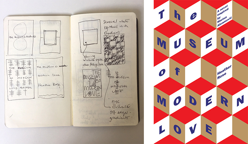
Sandy’s notebooks
Irma Gold: What led you to book design?
Sandy Cull: I completed a graphic design course and spent several years working in design studios, advertising agencies and then, when I lived in London for four years, magazine publishing.
Once back in Oz, I began freelancing for various magazines in Sydney before art directing a craft magazine for a few years. Wanting to return to Melbourne, a friend told me about a position for a designer at Penguin. It was love at first sight.
IG: What does a typical day, or week look like for you?
SC: I share a studio space with four designers, two photographers and four animation producers. I cycle either to or from the studio four days a week.
Every day I have at least one deadline, but often there are several things on my to-do list. It could be first cover roughs for a nonfiction book, text design for a fiction book, or time allocated for picture searching or photography, painting some hand type or scouting for props to shoot.
I do a lot of my reading on the train and at night, or on extended holidays. As a freelancer, I don’t tend to have many client/author/publisher meetings. Most communication is by email. Publishers make contact when they have a project in mind for me. If I can fit it into my calendar, I usually say ‘yes’.
IG: Do you read every book that you design the cover for?
SC: I read every fiction book from beginning to end. I could count on my hands the number of fiction books I haven’t read or finished. If I haven’t the time to read it, I don’t take it on.
For nonfiction, I tend to only read some chapters, as well as an introduction and a summary. Recently I have had several nonfiction books where I haven’t been able to stop reading at just a few chapters. I note Rise and Resist by Clare Press, which I couldn’t put down, and The Rapids by Sam Twyford-Moore.
 IG: How do you read? What are you looking for as you read?
SC: I take notes whilst I’m reading. I might sketch out things on a moleskin book, or use a drawing app or ‘notes’ on my phone. If there’s something unfamiliar, like a location or a particular phenomenon, or a moment in history, I will do quite a bit of research.
It’s important for me to get a visual accurate, and it provides, in the very least, a starting point. Recently I had to research a particular area of NYC around the beginning of the nineteenth century when the first blimps or dirigibles were being flown. A few months back I spent a day shooting on Phillip Island, where much of a fiction book was set. This saved me sitting in front of the computer conducting exhaustive picture searches and got me out of the studio for the day.
Then there is also a whole treasure trove of images I’ve being collecting by artists I’ve been watching for years. When I’m reading, some of these will come to mind, and I’ll make a note to revisit a particular artist’s work, to see what they’re up to.
Before I go to the screen, I will usually sketch some thumbnails.
 IG: What was the most challenging publication that you’ve worked on?
SC: Rather than mention any in particular, generally speaking, the bigger the author, the more challenging the brief. A big-name author usually needs mass-market appeal, so there’s loads more pressure and expectation for sales, and many more opinions involved throughout the process. Ironically, these projects are usually, though not always, less adventurous and courageous from a design point of view.
I do tend to work on books by big-name authors. It’s a complete privilege to work on them, and it’s a huge bonus if it comes more easily than anticipated. I think I tend to get these projects because I do have good stamina, and can usually go the distance that many of these covers travel. Whether that’s a good thing, is debatable.
Most often the agreement between a publisher and a designer is that the designer will supply three rounds of concepts for their quoted fee. These more difficult briefs often end up being many more than that. It can be eight or 10 rounds of finessing and tinkering. And rarely for an extra fee. I’ve outlined the process in more detail later.
IG: Have you been completely wedded to covers that publishers haven’t liked?
SC: This happens all the time. I’m going through a stage at the moment when just about every favourite concept is usurped by my least favourite. When will I learn to not include the concept I don’t want them to choose?
IG: What is the best thing about your work?
SC: I am in heaven working on books with folks who love books and, without exception, I feel blessed to read a book in manuscript form.
IG: What is the most challenging thing about your work?
SC: I have always loved working closely with editors, and so I do miss the sense of team that’s available in-house, when you can indulge over sets of pages, making the page perfect.
Maintaining balance between lots of work and none is always a challenge. And keeping myself financially viable in a difficult and constantly changing industry.
IG: How long does it usually take to design a book?
SC: It depends on the project, the publisher, and whether I’m lucky to be going through a ‘purple patch’, or am a little uninspired to be very efficient. A purple patch is described in the dictionary as a run of success, but, for me, it’s specifically a wonderfully creative time when I’m firing on all cylinders, when everything seems to come easily. It’s probably quite random but I theorise that if I have too much on, I am probably too stressed to be as creative as I can be.
As a general guide, I usually require a minimum of three weeks to read. I might spend a week researching and shooting, and drawing and scanning, to pull together first concepts, and another week to do another round, and perhaps another week to do a third round.
For the latest Markus Zusak, Bridge of Clay, I received the manuscript in early January and sent final art to press in late June.
IG: What kind of books do you love working on the most?
SC: I love literary fiction and nonfiction. Recently I’ve really enjoyed working on a lot of nonfiction projects that discuss really important and perhaps difficult issues. These books are necessary. Topics have included mental health in the social media age, women and Islam, the ‘Yes’ campaign, the #MeToo movement and, one of favourites of the year, Rise and Resist about revolution.
IG: What’s the most controversial cover you’ve created? Was it deliberately controversial? Or was the reaction to it unexpected?
 SC: I recently did a new cover for Charlotte Wood’s Stella award-winning novel, The Natural Way of Things. Encouraged by its courageous publisher, we deliberately chose a rather striking, close-up of a shaven-headed woman staring right into the camera. It was rejected by the supermarket chains who said they wouldn’t stock it with this cover, saying it was too confrontational and aggressive, but it’s completely right for the book. It is amazing that the publisher went ahead anyway. I think more often than not, publishers go for the safe route at their peril, and at the risk of their book being totally overlooked and homogenised with everything else that’s out there.
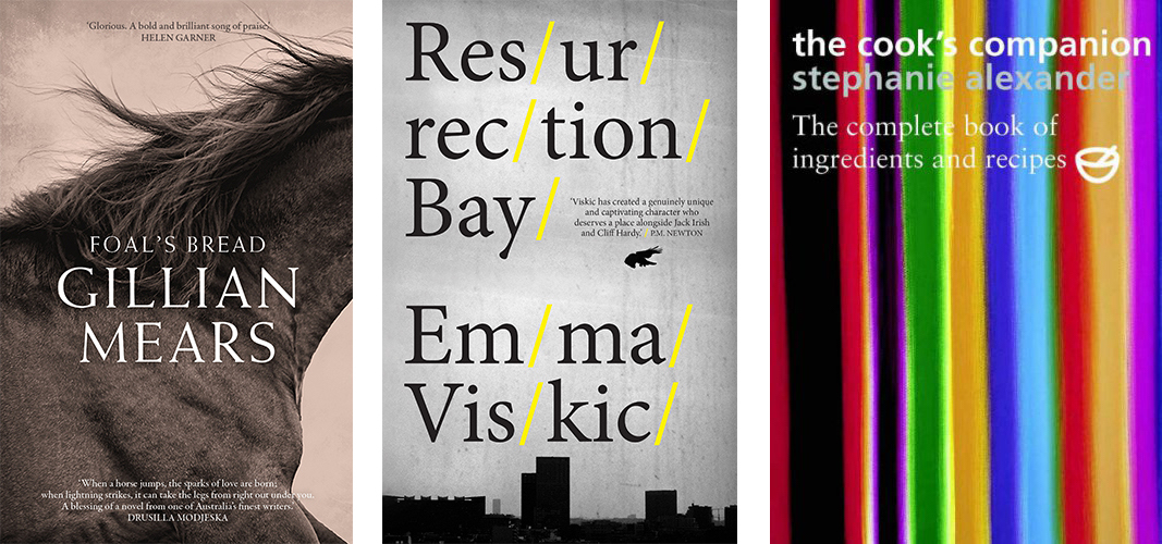
Another brave cover was Gillian Mears’ Foal’s Bread. I was specifically asked to avoid horses on the cover because it might pigeonhole the book in the ‘horsey’ romance genre. As it turned out, a horse is exactly what we put on the cover but it definitely didn’t look like one of those. I remember punching the air in delight. The close-up image was so arresting and perfect, that it took my own breath away when I found it.
The first cover for Emma Viskic’s debut crime novel, Resurrection Bay, was another brave choice. Again the supermarket chains complained about the forward slashes and asked for them to be removed; for the typography to be changed. Fortunately, the relatively new publisher [Echo Publishing] refused to budge and it not only sold its socks off, the author went on to win several awards.
Way back in 2005, The Cook’s Companion was quite a radical cookbook cover. Featuring a painting we commissioned by Melbourne artist Mathew Johnson, it still amazes me that we got that through back then, and that it remains the cover 13 years later.
 IG: Can you take us through the process?
SC: I send out a general breakdown of my processes to self-publishing authors before we get too far down the track. I find this is really helpful for them and makes things completely transparent. Below is an edited version:
I usually like to receive a comprehensive cover brief from the publishers, with all practical details included in the document.
If we proceed, I would supply the author with a blank brief to fill in.
I supply a minimum of three stages of concepts, each with several variations.
These concepts may use low resolution images found from a variety of sources. My fee does not include any image fees.
From first concepts, we usually go to a second stage, where I present ‘second’ concepts if the first stage was unsuccessful or I finesse one of those first concepts. Repeat this process again for ‘third’ concepts, after which we hopefully have a cover approved. High res and final images are sought and I proceed to final art, which I upload to a chosen printer.
If the concepts are unsuccessful, after three stages, we may choose to part ways. This parting is often referred to in the industry, regrettably, as a ‘killing off’, and comes with a ‘kill fee’.
Printers
I would expect that most self-publishers do the groundwork with their printer of choice and already have made their choices and have print quotes before they come to me. I can put them in touch with a print broker or production person who can liaise with printers.
Text design
I love designing the internal pages as well, and this usually happens after we have an approved cover. I design the text design to match the preferred page extent.
Typesetting
I generally don’t typeset books from beginning to end, but am happy to do so, if I have time allowed in my schedule. Otherwise I liaise with typesetters.
IG: Can you explain the feedback process?
SC: For the mainstream publishers I am dealing directly with a senior editor. They relay all the feedback from the publisher and from the sales and marketing team. I deal with a publisher directly if they are handling a super important author, or if they are particularly hands-on with the book concerned.
Only after the cover has gone through the back and forth of cover meetings and finessing, more cover meetings, more finessing, and is approved by the necessary people in house, does it get shown to the author. It’s often by then a fait accompli. The agent is also involved at this stage. Very occasionally the author or agent might not be happy but this is an exception to the rule.
The rigour a publisher provides can sometimes result in a better cover, and perhaps a more successful book. Sometimes though it can result in a ‘designed by committee’ mediocre cover that looks like the last bestseller.
For self-published books, the process is usually much more fluid and speedy. All the communication has been between designer and author and there is no sales and marketing department to please, and no agent.
This can be refreshing approach. Though they’re acutely wedded and invested in the book, they can be very accepting of your input. They may have no experience in design and marketing, and are pleased to have a designer guide them through, and help them make the right decisions about what will work.
Window onto some of Sandy’s designs
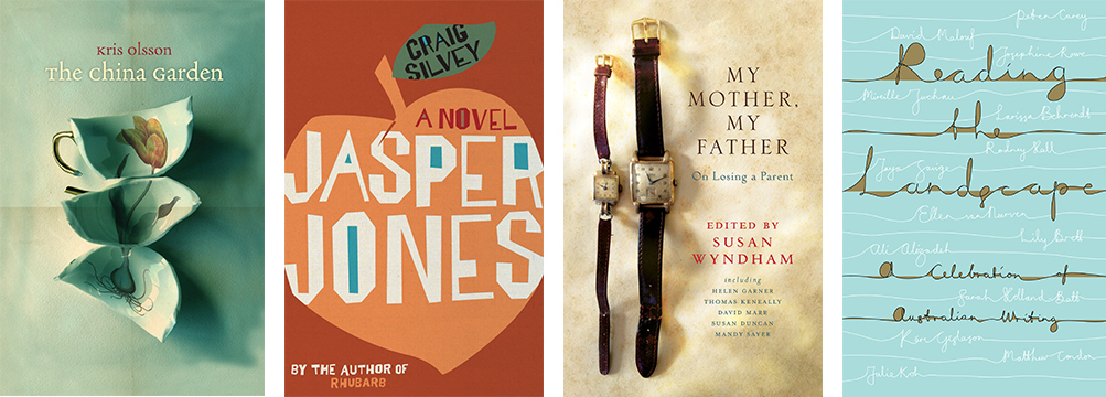
The China Garden by Kris Olsson
This is quite an old cover but it is still one of the ones I’m most proud of. I bought the cups from an op shop and broke them in the studio, photographed them and superimposed the tulip onto it.
Jasper Jones by Craig Silvey
Another old cover, but I’m really happy with the typography. I placed an old print texture of CMYK dots over the top so it had a 1950s feel.
My Mother, My Father edited by Susan Wyndham
This cover still makes me smile. I put a call out to my friends asking for old watches that I could borrow to photograph. One belongs to my husband and one to a friend, but they are like an old couple, and perfect for this book.
Reading the Landscape: A Celebration of Australian Writing
I only presented one or two concepts for this UQP anthology. I spent hours handwriting some type with a paint brush, as well as producing this more fluid type in the Illustrator program. It felt so right to me. The publisher agreed and went with it immediately. Love that!
This month I have a copy of Sandy Cull’s latest design of The Natural Way of Things by Charlotte Wood to give away. If you’d like to get your hands on this incredible Stella Prize-winning novel, simply sign up to my monthly newsletter (sign-up box on this page) before 5 pm on Monday 17 December to go in the draw.


